Miniature Monthly Contest - Feedback!
The end of last year, I raced to finish off a piece for a competition organised by Miniature Monthly. I faced a lot of hurdles trying to get the piece finished in time (the whole saga is logged here). The end result was a miniature I was pleased with but wasn't up to a standard I knew myself to be capable of.
The contest itself was fantastically successful and the Miniature Monthly group has really become a great network of painters. I'm a big fan of painting competitions, not for any really hope of winning but for the feedback that masters of painting can provide. Unfortunately the feedback is often scant and generic. For this contest however, Aaron went above and beyond. Not only did he give a super detailed breakdown of each part of the model but he also photoshopped a photo of my mini to highlight what he was referring to:
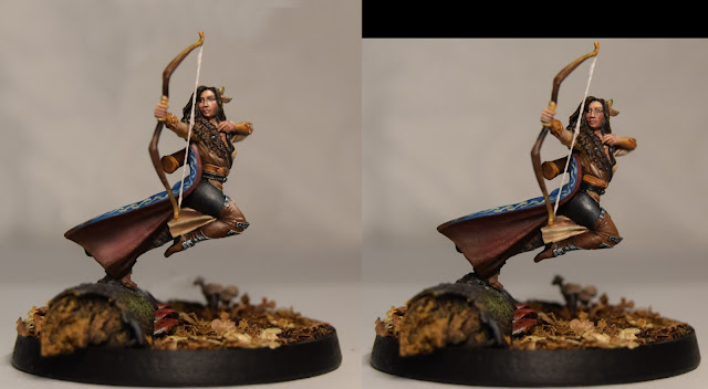 The mini on the right is my submission, on the left is Aaron's modification - I think you can see how much better it looks!
With Aaron's permission, I have included his full comments here. I think for a lot of painters working to step up their game, this feedback can be really beneficial. You can see more details of how I painted her up originally here. The big things for me are 'contrast' particularly how to give realistic high and low lights and start to factor in the material.
Aaron's full comments:
Once again a big thank you to Aaron for providing such detailed feedback, it's already helping me and I hope it helps a few others that read this.
The contest itself was fantastically successful and the Miniature Monthly group has really become a great network of painters. I'm a big fan of painting competitions, not for any really hope of winning but for the feedback that masters of painting can provide. Unfortunately the feedback is often scant and generic

With Aaron's permission, I have included his full comments here. I think for a lot of painters working to step up their game, this feedback can be really beneficial. You can see more details of how I painted her up originally here. The big things for me are 'contrast' particularly how to give realistic high and low lights and start to factor in the material.
Aaron's full comments:
First off, thank you for taking the time to enter our first contest ever!!! We were so happy that you could join the madness! We couldn't believe how many entries we got and you were a part of that!!!
Ok, here are my thoughts on your piece. First off, you made the initial cut which means you piece was a stand out piece! Your painting is very clean and that is a good thing because now all you have to do is start tightening up on your details and continue working on your blends. I have attached a photoshopped picture for you to reference.
Skintones: The left cheek is a little too dark, I lightened it and then added some final highlights to the entire face....forehead, cheeks around the eyes, nose, chin, lower lip. I also added a little pinkish tones to the cheek to add body and make her skin look alive. Your left eye is great! The right eye is a little off to the right, I know that was a problem eye for most people in the contest as the hair is right there but keep working on it! I also added darkened orangish brown tones in between the fingers to give them more definition.
The Bow: Your bow is pretty good, I just added a little darker brown right before the handle...it gives it more definition. I also added some darker tones on the little grip thing so that it is better defined...it's all about those little details, make them visible.
The Metallics: Your metals were pretty good, just keep adding those really bright edge highlights, as they really do make the metals shine. I use Titanium white for this as it is the brightest white you can get.
The Belts and Leather leggings: I added darkened areas before and after each buckle and belt end piece. See how that makes them more visible? I also added weathered edges to all of the leather bits...this helps better define them, it looks cool and also its just easier to see and helps the viewer know, "this is leather".
The Shirt/skirt: Basically I just adjusted your colors a bit on the lower part of her shirt, making it a bit darker towards the belt and smoothing out some of the parts that were a little to dark. I also fixed the lower "skirt" part as it looked like it was not finished as well as the other areas.
The Cape: Great colors and I love the freehand, I bet that took a a lot of minutes to do! Keep working on making the lines crisper and crisper. Also, I added a highlight to the upper part and lower part of the red side. It just gives little more body to the cape.
The Hair: Maybe just a touch brighter at the top where the sun would glisten off of it. Also check the feathers, you did a great job detailing them, I added a little darker tone to the base of them and then a final whitish highlight to the upper tips of them. See how that makes them look even more awesome?!
The Base: The base is cool, I love the mushrooms and the log. I like that you put the moss on the log. I think you maybe could have sprinkled in some color to the leaves. Just a little bit to give them some variation. Also, see how I straightened up the girl, she was leaning a little too far forward, I kind of feel like she is in the process of falling, so if you straighten her up it makes a big difference.
That's it for now, again, thank you for entering and being a big part of the Miniature Monthly team Dev! I know you have been with us for a while and it is really encouraging to see you grow as a painter! As always, if you have questions about this particular project or projects in the future, don't hesitate to ask!
Once again a big thank you to Aaron for providing such detailed feedback, it's already helping me and I hope it helps a few others that read this.
- Raggy, signing out
Comments
Post a Comment